Posted: September 13, 2016, 12:41pm
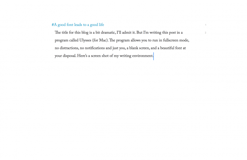
The title for this blog is a bit dramatic, I’ll admit it. But I’m writing this post in a program called Ulysses (for Mac). The program allows you to run in fullscreen mode, no distractions, no notifications and just you, a blank screen, and a beautiful font at your disposal. Here’s a screen shot of my writing environment.

Jealous? You should be.
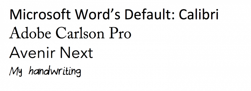
It took me a while to realize the power of a good font. The defaults in many writing applications are okay, but not *inspiring*. I’m not just talking about writing either. I changed all the defaults in all my code editors (I use MatLab’s code editor, and an editor called Coda for web development, and sometimes I use Xcode for iOS side projects). Since I spend most of day writing paragraphs or functions, it makes it easier on the eyes to choose a good font. Here’s some of the ones I use, right below Microsoft’s Default for comparison.

I use Adobe Carlson Pro for my longform writing on Viterbi Pulse, or my other website, Into the Image. This font feels like a good font you’d see on a typewriter, or in a book. It’s the font of a writer.
I use Avenir Next for my coding environments. The letters are spaced out just a bit more, which is nice for readability when you’re using a lot of parentheses, commas, and brackets. It also has a space-age, next-level feel to it. I want to feel like I’m creating something cutting edge when I’m programming.
I made my own font, too. I have a Bamboo Tablet and wrote out all the letters of the alphabet and the special characters and converted this into a .ttf file, uploaded it to my Mac and voila! You don’t need the tablet to do it, you can use a pen and paper and scan in the letters, too! Now I have a font that matches my handwriting. I use it to type letters that seem personal, but are quick to type.
I hope that gives you some ideas to spruce up your computer environment this week. Enjoy!
Published on July 25th, 2017
Last updated on August 10th, 2017

