
November 2, 2016
I follow this most excellent blog on Tumblr called Accidental Art. They post submissions from scientists who make a mistake when plotting results. These mistakes often turn into mind-bending, even strikingly beautiful images. So the next time you accidentally label every single data point, make the line thickness 300 times too large, plot the axes backwards or multiple times, why not submit it to Accidental Art? Here’s a few that I’ve made.
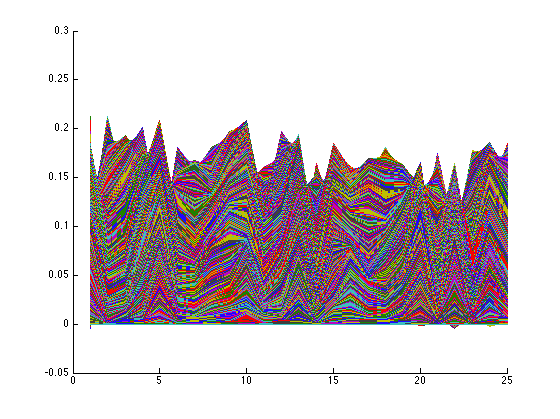
The first accidental art is a chart of the progression of breast cancer metastasis. Before I labeled the axes I made the transition lines too thick, and this is the result. Very cool!

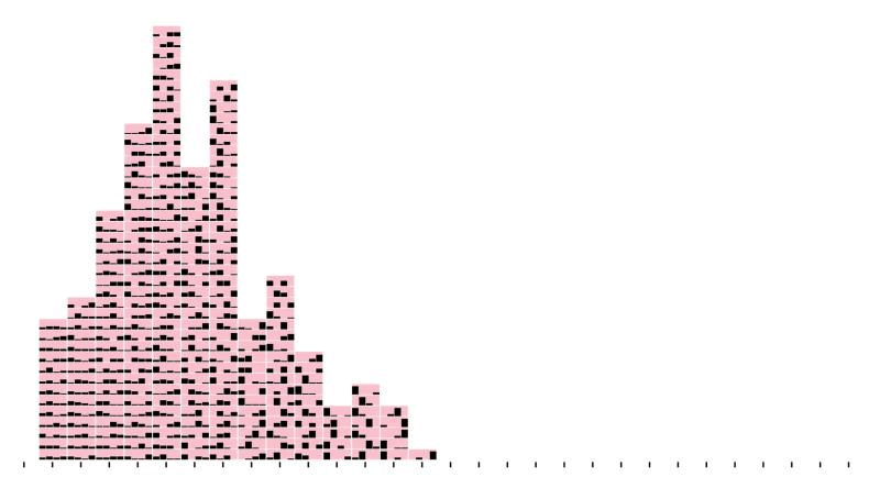
The second is a pictorial histogram of the effectiveness of various chemotherapy schedules. The black bars are the dose administered per day, and each pink block is different schedule. While there is technically no mistake in this graph, it’s fairly useless without seeing any visible trends. But it looks cool I guess!
I don’t remember where this graph came from, but it looks like an elephant, doesn’t it?
This next one is the inspiration for the title of this blog. The best part of these accidental art designs is that they would look pretty good on a t-shirt — or dare I say a Christmas sweater. The image below could be straight out of the baggy sweater that grandma gave you last Christmas.