
Posted: January 9, 2017, 10:53am
I got the coolest Christmas gift: a book on the visualization of data. It’s a classic, landmark book by the famous Edward R. Tufte, who was has written several seminal books on the topic.
The book explains the how-to of the display of data, rather than a how-to of the analysis. Sometimes an analysis of a dataset may be expertly done, but poorly presented. How can we organize the data using shapes, line thickness, layout, size, and color to best deliver the important information to the viewer? Tufte is an expert in answering these questions and the 200 page books has examples from Leonardo da Vinci’s hand-drawn masterpieces of visual display of information in 1270 to the modern computer graphics renderings we appreciate today.
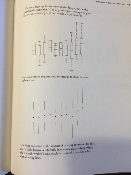
One such example in the early pages of the book (I haven’t read the entire book yet) is a simple redesign of a box and whisker plot. The top graphic shows the median and each quartile, which is useful information about the difference in averages and variance across different sets or parameters. But we can do better, says Tufte! The bottom design isn’t just about saving ink. It’s about giving the viewer a better sense of the importance of each line. A center dot is given an extra thickness to point out the importance of the median value: the central value for each box/whisker plot. The thinner lines are important too, but vastly simplify to give the eye and easy comparison of the length of these lines across each plot, without the distracting and unnecessary horizontal lines.
Published on July 26th, 2017Last updated on August 10th, 2017